Need Help?

For students managing design work, sketching, deadlines, and creative pressure — and for educators seeking greater clarity in their teaching — this blog offers focused, practical support in Design & Technology, from visual communication and design process thinking to digital fabrication. For those seeking more tailored support, I am also available for student consultations and teacher workshops. Since 2007, DesignJournalSOS has helped readers navigate real classroom challenges with grounded strategies and insight. Have a question or topic you’d like explored? Your reflections are welcome — they help keep this space alive and growing. Copyright © 2007–2026 Daniel Lim

27 June 2012

Oblique Drawing to One-Point Perspective + Isometric

First lesson for 2N1 and we are left with 15 minutes. So I did a little bit of introduction to Isometric Drawing with everyone starting to draw. Last year, I taught the same group of students how to draw in Oblique Drawing so that they can use the same technique to present their final product for submission. This year I will be introducing them the Isometric Drawing Technique. A slightly more realistic drawing technique compared to the Oblique Drawing Technique.

Next, the relation between the Oblique Drawing and the One-Point Perspective.

The interesting thing is this, a One-Point Perspective Drawing is derived from a slight deviation from an Oblique Drawing. Both still have the same full 2-D front view of the object. The only difference in a One-Point Perspective is that its 3rd dimensions are drawn aligned to a POINT (wherever the artist wish it to be). The 3rd dimensions of the Oblique Drawing are simply projected at 45 degress parallel to each other. In the One-Point Perspective Drawing, when the 3rd dimension lines are drawn towards a POINT, what you have created is an illusion that objects further away looks smaller! Therefore it looks more realistic than the Oblique Drawing.

Which is better?
For the sake of comparison, as mentioned before in class the Isometric Drawing is a better option in drawing than an Oblique Drawing because the Isometric Drawing represents the real world better. Instead of parallel 3rd dimension projections, the isometric is 30 degrees off the horizontal for its 2nd and 3rd dimension. If that is the case, so it seems like the One-Point Perspective drawing is a good competition to the Isometric Drawing as far as 'realistic' representation of an object is concerned.

Well yes and no. though the One-Point Perspective does presents objects in a more realistic 3D manner (like the Isometric Drawing), a straight-forward 2-D front view to begin with still does not represent the real world very well. Take a look at objects around you, do they all appear perfectly 2-D in the front? However, the One-Point Perspective Drawing is still widely used in Interior Designs and Architecture presentations of the designed environment because they do look good if well drawn.

An even more realistic drawing technique will be the extension of the One-Point Perspective - also a slight deviation from an Isometric Drawing - It is called a Two-Point Perspective Drawing. The Two-Point Perspective Drawing is not shown in the example above but you may find it in many of my previous posts within my blog.


Alternatively you can also watch a video showing the 4 main types of drawing techniques I talked about in this post.

Just in case you are very keen, the final type of drawing technique makes use of three points and you call that a Three-Point Perspective Drawing. Ever watched Spiderman on TV or read any Marvel Spiderman Comic Book with 'Spidey' swinging from the top of the skyscrapers and the camera view showing all the actions from the sky down? Did you notice how the buildings looked like? That is a combintion of One, Two and Three Point Perspective. Cool isn' it?

The more types of drawings you learn, the better you will be in selective the best presentation style. All drawing techniques ranging from Oblique to Isometric, extending to One-Point and Two-Point Perspectives (and even Three-Point Perspectives) can be used equallly effectively in your idea presentation. But you need to know each of their differences, their limitations and their strengths so that you can apply them meaningfully to capture the idea you want to present.

Here is a FIVE-POINT Perspective tutorial link if you are REALLY REALLY keen. It is pretty easy to understand what is going on in the tutorial. Below is my very first attempt at 5-Point Perspective Drawing much later during my free time.
5-Point Perspective (Fictional) Commercial Area Sketch

Let me know if you have questions.

26 June 2012

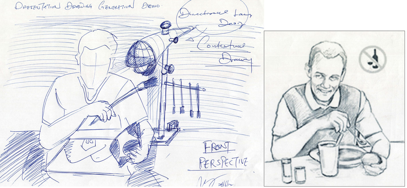
Presentation Drawing in Drawn in Sub-Context & in Context - With Human Figure Interaction


Another example of a sub-contextual drawing (LEFT) making use of an image resource (RIGHT) from the internet. Note I do not draw the face. I like to leave it 'faceless' so that the figure can represent anyone.

To do this, I made use of the image resource, place a piece of paper over it to trace the main elements and omit the unnecessary parts. Alternatively you can use your reference to 'redraw' it on a new paper. Finally draw in the product used in its context.

Note that all drawings should present the same perspective.

The example above is a step better than the previous. The presentation is not only drawn in context - you can easily recognize a home (or a room) with the addition of the window and curtains in the background. To enhance your presentation, you should also consider include some shading or coloring.

Working Drawing Components


A Working Drawing has the following usual components:
  1. An Isometric Drawing showing the Part Numbers (or Part Labels).
  2. An Exploded View (or Assembly Drawing) showing where the parts go and their fixtures.
  3. An Orthographic Projection (First Angle) showing the overall and necessary minor dimensions.
  4. If you can afford space for Part Drawings or useful Sectional Views to be included, go ahead and do so. Otherwise you must at least have those in of your development phase. Just think about the part drawings as a summary of your conclusions on the physical product project. Showing all the details, positions, trim lines and dimensions. (Note: Production Sequences and a Gantt Chart Production Plan need not be present in your presentation boards, however they MUST be included at the end of your development phase.
  5. A Material List showing all the Part Numbers, the Materials used, the Dimensions and the respective Quantities.
Some Tips and Pointers:
  1. Isometric Drawings: If the product has several components, especially those with components within each bigger component, you may consider drawing those components and label them seperately. It is impossible to draw all of them within (with lots of hidden lines) and attempt to number them off. That will be VERY messy and impossible to read. Finish off with a neat Exploded Drawing to show how each components come together.
  2. Exploded Views: As long as the parts are aligned consistently (Isometric or Oblique) your exploded view should look neat. Not all parts can be aligned straight to its connection point. In this case you can draw your component slightly off, but use lines to create a 'path' to lead it to the connection point. The example above has everything aligned. For an 'off' example click here. In the linked example you will find a dowel that is not aligned.
  3. Orthographic Projection: Leader lines should not touch the main drawing and should have a lighter line weight than the object. A good guide would be at least 10mm away from the drawn object. Spacing between dimension lines to the next should be consistent. A good guide would be at least 5mm away from the drawn object. Dimensions are usually written 'on' the dimension line. For vertical dimension lines, the dimensions are usually written on the left of the line following the orientation of the line.
  4. Material List: Most common mistake is the written dimension. Lenght = the longest or the largest dimension. Followed by Width and the smallest dimension is the Thickness. It is worthy to note that numbering in the material list goes from '1' from the base up.
  5. Do give a name for your project to be included as a 'Heading' for your Material List. Rather than "Material List' as your heading.

14 June 2012

D&T Coursework & Theory Plan for July and August 2012


'N' Level Deadline : Term 3 Week 8    : MONDAY   : 13 August 2012
'O' Level Deadline : Term 3 Week 10  : TUESDAY  : 28 August 2012

Part A: Design & Technology Theory
  1. All Subject Contact Time (SCT) periods will be used for theory practice. 
  2. Bring all your past year questions.
  3. Priority will be given for students with questions and I will address those questions during SCT. 
  4. You may ask or discuss questions on any topic ranging from design to technology. 
  5. Questions can be coming from past year papers, or any topics that require clarification or to be elaborated, etc.
  6. If I receive no questions, then we will attempt the questions from past year papers in sequence.
Note

  • 5NA SCT : Term 3 : Week 1 to Term 3 Week 7 : Friday,  2pm to 5pm.
  • 4NA SCT : Term 3 : Weeks 2, 4, 6, 8, 10         : Monday 2.30 to 3.30pm.
Part B: Coursework
  1. All official classroom session will be used for completion of the three Presentation Boards and fine-tuning of your design journal ONLY. 
  2. If have not completed your product for some reasons you can only do it after school.
  3. All drawings in pencil drawn to scale according to standard drawing convention. All drawings inked in black once confirmed by teacher.
  4. Complete your Working Drawings and Presentation Board components in the workshop (with the help of the Instructors when I am not around)

Term 3 Week 1 & 2
  1. 1 x Part Lists (in Orthographic + Dimensions for every part)
  2. 1 x Isometric Drawing (no dimension + no label) - Showing Overall Product, i.e. everything in. e.g. if study desk, then draw the desk together with the drawers)
  3. 1 x Isometric Drawing  (no dimension + no label) - Showing Individual sub-Parts. e.g. if study desk, then the desk without the drawers + and another set drawers only).
  4. 1 x Isometric Drawing (+ Part Numbering) - Showing Overall Product, i.e. everything in. e.g. if study desk, then draw the desk together with the drawers)
  5. 1 x Isometric Drawing  (+ Part Numberingl) - Showing Individual sub-Parts. e.g. if study desk, then the desk without the drawers + and another set drawers only).
  6. 1 x Material List

Term 3 Week 3 & 4
  1. 1 x Orthographic Projection + Dimensions (Showing Overall Product, i.e. everything in. e.g. if study desk, then draw the desk together with the drawers)
  2. 1 x Orthographic Projection + dimensions (Showing Individual sub-Parts. e.g. if study desk, then the desk without the drawers + and another set  drawers only).

Term 3 Week 5
Using the Isometric drawing drawn in week 1:
  1. 1 x Exploded View(s)
  2. 1 x Presentation drawing in contextual use

Term 3 Week 6
  1. 1 x Presentation drawing in contextual use complete with rendering

Term 3 Week 7
  1. Fine-tune Design Situation, Design Brief, Design Specifications
  2. Presentation Boards Complete.
  3. Product Prototype Fine-Tune and Complete.
Note
  1. I will not be in school during Term 3 Week 2 & 3. 
  2. During these two weeks, all students to follow plan above in the workshop.

11 June 2012

D&T June Holiday to August 2012 Coursework Assignments

Every point below is IMPORTANT:

D&T JUNE Week 3 & 4 2012 Coursework:
  1. Come to the workshop during Week 3 and 4 of the June Holidays ONLY if you are touching up your coursework, otherwise stay at home.
  2. For working drawings, you must study your textbook on how to do each of them correctly before you start yours. That includes how to draw different types of lines (e.g. difference between dimension lines and product lines, etc., how draw to scale, how to dimension correctly, etc.
  3. Come back to school in July with the various types of drawings required in a working drawing completed. I’ll then give you feedbacks on your works to guide you towards submission standards. In some cases you will need minor changes. In other cases you may need to re-do. That depends.
  4. Update and stand-by your material list somewhere in your design journal. Do not bother to decorate it! You will eventually need to produce another one with just the right size for you to insert in your Presentation Board.
  5. Complete one A3 size Presentation Drawing (draw in contextual use).
  6. Do not ink your drawings yet. You will only ink them when the school begins in July and after I have seen your drawings. Inked drawings will be used for photocopying and scaling, etc.
  7. All drawing guide lines must be light and soft to facilitate erasing in case of mistakes. Always use guidelines to draw your project.
D&T JULY to mid-AUGUST 2012 Coursework In-Class:
  1. 2012 July – Completion of all Working Drawing + Presentation Drawing components for Presentation Boards.
  2. 2012 August – Design Journal Component (P&M, Research, I&D) Touch-Up + Written Theory (Design +3 × Technologies)
D&T JULY to mid-AUGUST 2012 Coursework After-Class:
  1. 2012 July – Product Prototype Completion + Touch-ups.
  2. 2012 July to August – Design Journal Components + Presentation Boards Components Touch-Ups.

08 June 2012

Reflections for the June 2012 Holiday 2 Weeks D&T x'TRA Sessions + Week 3 & 4 "SUPER-x'TRA"


June 2012 Week 3 and Week 4 "SUPER-x'TRA" D&T Session Attendance Sheet


I used to have more time in June to enjoy more of going out for afternoon coffee with a book. Or coffee and sketching everything from new product designs, or of any stuffs I can see. Look out for cool design stores I can bring my students to visit in the future. To find new hardware places my students could go. Or coffee again to think about D&T, to reflect on the processes, to think about how I can teach it better, to think about how I can help my students to understand and learn better, more fun, more cool, more interesting, more innovative, more satisfying. Or to fiddle on my iPad on new ideas for teaching, new mind-maps on design which I can share with my students when I see them. Explore new softwares or apps which I can use to teach. Explore new websites I can include alongside with the many I already have in my design blog. Or do street or nature photography etc...


Now it's much less...

June holidays are crazy periods. Not crazy about going out for holidays or chilling out in the cafe reading or sketching though. But crazy with students after students for consultations, for specific instructions on every 'hows' you can imagine starting from explaining and demonstrating the most basic processes to the most complex; and demonstrating the most basic drawing techniques to the most complex structures.

Similar to the last three years, this first two weeks of the June holiday was spent with my students from 0800hrs to 1700hrs (with an hour lunch from 1200-1300hrs). More extensive and intensive than all the busiest school term days combined.  Now I am offering to extending the sessions into Week 3 and Week4, which I call the "SUPER x'TRA" because I see there is a need to. But I wonder if my students see the same need.


As a side note, just after you all left the workshop today, Mrs Wong asked me if both of us would take turns to come back during Week 3 and 4 to help those who need. I was so touched. And I thought these students are just so blessed...

If my students had worked more consistently. If my students had come back more regularly in the afternoon to be helped. (I had 8 full weeks of afternoon consultation schedules before June but they were hardly filled up. Even if they were booked, there were most likely, as-if, 'forced' into making a reservation because I made it a requirement for them book at least once every fortnight). If my students had listened to me, read my posts, studied and applied them diligently, there will be lots of questions that could have been resolved, there will be less mistakes they will make. If... 

Hopefully, when we arrive at July and August. There is no need to look back and say on the day of submission 'I could have spent more time. I could have been more diligent. I should have known this and that, I should have taken more initiative to...'.

Students you only have ONE life. One opportunity to do D&T. One opportunity to get the best grade. Make the best of 'NOW'. 

I hope your 2 weeks in June with me and the Instructors (Mr Lim and Mr Ho) were well spent. Do not forget to thank the instructors. Hope you did catch up with what you missed during the school term. We have all worked hard. We have all sacrificed our holidays. I just hope to see that the time and sweat that was spent will bear sweet fruits in the end. 

Week 3 and 4 June Holiday "SUPER x'TRA" sessions will be based on appointments only. I reserve all the rights to accept or reject any appointment. 

Send your request for my presence via email (mrdanielsos@yahoo.com.sg) 
or message me thought FB at least two days in advance. 

Priority for consultations will be given to the ones who made an appointment with me. 

Remember to sign in and out.

Do you have the same hope and aspiration?

26 April 2012

Idea Generation & "Back to Perspective"

The idea of sketching ideas back in their contextual perspective is not new. I talked about this many many posts back. Just in case you might not have seen or know about it... here is another one.

.......................................................................................................................................
During the stage of idea generation (or development), it is common for students to sketch the proposed solution as it is being explored or refined (if any) with no reference to the object it is intended to hold or the user who is supposed to be using it. It is like idea generating a pencil holder without any pencils in view. Note: Coincidentally, the three examples below did not show the user at all in order not to complicate this post.
.......................................................................................................................................

But you should observe that all three examples I have below, 1) an Umbrella Stand, 2) a Satay Sticks Monouverer, and 3) a Mobile Phone stand for a Bike, all have TWO things in common.

FIRSTLY, up to a certain stage in the idea generation process, 1) an Umbrella is sketched in, followed by a few,  2) a Satay stick sketched in, and 3) a Mobile Phone sketched in - all of them to get a 'feel' of the proposed solution when it is in use with the object they are intended for. 

SECONDLY, up to a certain stage in the idea generation process, 1) a Shop is sketched in, 2) a BBQ pit is sketched in, and 3) a Bike handle bar is sketched in.

What for?  To get a 'feel' of the proposed solution when it is in use with the object they are intended for. Why? Because ultimately these products got to be used in those proposed contexts!

 Umbrella Stand

Satay Sticks Monouverer

Mobile Phone stand for a Bike

Another reason why you ought to be doing so is so that you would be able to be sure that the proposed solution is likely to look right (or not) or likely to work (or don't work) in its rightlful context. To be dead sure, you may even want to move on to make a quick mock-up and place it there or start 'using' it in context.

In conclusion,
Idea Generation without including and evaluting the intended objects as it is being used or the user who will eventually be interacting with it, is like talking about the adrenaline rush you get on a roller coaster ride - and this is what you see:  there is no one on it, no sight of the coaster rails and the roller coaster is just aesthetically pleasingly sitting on concrete ground.

24 April 2012

Idea Generation - Focusing on Alternative Functionality


Here is a simplified presentation on how I meant in class when I say,

"Generate ideas focused on the functions first. i.e. think and sketch different ways to make it work. Make use of your list of design specifications that mentions functions. Generate alternative ideas. Assess them. Evaluate them. Combine, modify and improve the ideas that you have. Do a quick mock-up and test out your ideas. A certain point of time, draw the hand in; draw the target user in. Remember to draw your more or less refined idea to be used in context to get a feel of how it may work. Use various drawing techniques to present your ideas. Annotate them to communicate how the idea is intended to work, etc.".

The example above shows you only two alternatives to secure cables to a table. The first one was in fact... well... literally my first thought of using a little blob of blu-tack to simply 'stick' the cable to the table. That was nevertheless an idea wasn't that? Then later what seems like a 'hook' idea came to mind and you have on the right side sketches of how a 'hook' may be used to secure the cable. You should notice that in all cases I sketched in a cable. 

Continue in a clockwise fashion, you notice some development going on. I have started to stretch the hook and make it slightly longer so that now I can secure up to three cables. Addition features at the ends of the hook to provide stability, etc.

At the bottom, assuming the idea was sort of developed, I began taking a step back and sketch in hands interacting with the hook cable securing idea. Sketching the hands in is a good way to visualize and appreciate how large (or small) the product may be. Good for sizing at the later stages. Good also if I decided to disappear in the workshop for a mock-up or two cause I have a good idea on its possible size and the diameter just by looking at my sketch. I could have further modified the hook's diameter and lengths so that it looks more proportionate or asymmetrical or 'balanced'. 

So you see, the idea generation process is very lively. Its very free. It doesn't condemn a bad idea. In fact there is no bad idea. If an idea doesn't look good, it can always be modified so that it works.

------------------------------------------------------------------------------
Notice also that every proposed idea is extended via presenting them with a) additional perspectives and b) human interaction to show success of functionality and usability, i.e. shown being viewed in different angles and using multiple drawing techniques, e.g. a combination of 2D and 3D drawings and exploded views when necessary. 

This important step serves two purposes: 
  1. It helps to present the proposed solution clearly by helping the designer (and the reader) 'see' the solution in an all rounded manner. And
  2. Because the proposed solution is shown sufficiently in as many views as necessary, any problems or 'faults' can be easily picked up and that enables the designer to make effective improvements or propose alternative solutions to make it better.
(Included and updated on 28 August 2013)
------------------------------------------------------------------------------

One common problem in a student's attempt in idea generation is to sketch an idea. Somehow it either looked funny or will not work. Then make a comment that it doesn't work. Then move on to another entirely different idea. That is not the way to work with ideas. 

You just killed one potential idea that could have been modified and developed so that it will now work instead of abandoning it.


The second example above show another idea generation starter. This time is an attempt to start generating ideas on the different ways to connect individual photo frames vertically and how they can be detached and add on easily. Not much detailing but you do see some development going on. For example you may see some details on how a magnet may be fixed into a 'cap' like structure for the magnetic connection idea. This is sometimes necessary because I would need have a 'feel' how how that might work. And one way to do that is to sketch them in exploded views and 'visualize' how each parts interact.

If I chose this concept for refinement or development, then I will move on to generate better ideas that works, decide on materials and making methods, etc.

--------------------------------------------------------------------------------
(First edition of this post on 24 Arpil 2013)
(Second edition on 20 August 2013)

12 April 2012

Presentation & Working Drawing - A Simple Version

First of all, let me clarify why the title reads '... Simple Version'. In the GCE 'N' and 'O' Level Requirement, students are expected to produce a presentation drawing that is drawn in context. That is to say the product illustrated with user interactions within the proposed environment.

However, for my students in Secondary Two, the requirement for their presentation drawing is much simpler. As long as they can illustrated their design showing clearly the product in use, that is a good job done.

Below are examples which I showed my students in class what the hand-in quality of their presentation drawing and the working drawings should be like.

I did not follow use the students' theme 'Dining Experiences' cause I didn't want them to 'copy' my demonstrations. Rather to learn to design independently and with full autonomy.
A Sample of a Fish Note Holder Presentation Drawing

Nothing special here. Just the proposed product. Holding what it is intended for - business card or notes. Presented on a table. The students are free to add colors to it to enhance their presentation.


A Sample of a Fish Note Holder Working Drawing

Nothing special here again. In fact that is almost a complete working drawing. Shown in the example above are the basic essentials of a working drawing. 1) An Isometric View of the product with all the parts labeled, 2) An Orthographic Projection of the product to show the various dimensions and finally 3) A Material List.

Noticed in the Working Drawing sample I added a base to it. I did this because there are some students with more than one part to their design. So in the demonstration, I hope to cater to their needs by simulating an additional piece.

IMPORTANT:
The material list shown above is not entirely correct. It was deliberate.
Why not you spot what is wrong?

3D Drawings - Oblique and Isometric Drawing Practices


Classroom demonstrations on Oblique and Isometric Drawings.

Practice, Practice and Practice.
The only way to improve your drawing skills. There is no short cut.

20 March 2012

How Does a Facilitation on Processes for Making Look Like?

I've begun afternoon consultations for my Secondary TWO students.

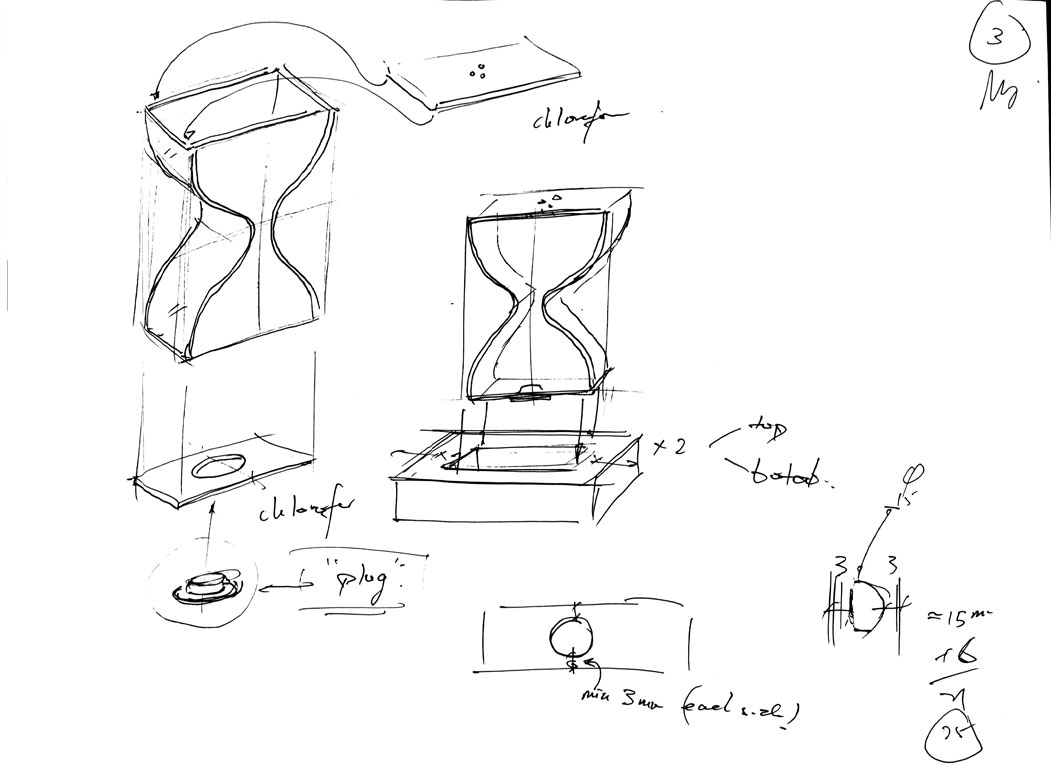
Below you'll see how I facilitated 2N1 Angeline Salt & Pepper Storage over a time period of 30 minutes or so. Angeline final concept (not shown), was a skinny (side-view) 'hour-glass' shaped holder made of acrylic, and wood at the top and bottom as support. However there were difficulties in working out how to develop the parts to dispense Salt or Pepper, for re-fill and to able to keep all the little parts intact all the time.

Page 1:

My first task was to help Angeline understand different possible ways to construct the 'hour-glass' concept. She already had it worked out from a series of idea generation and refinement rounds to come out with the two flat 'hour-glass' panels cut out from a single acrylic sheet and covered using a formed acrylic strips at both open-ended sides.

At Secondary TWO, I would expect she might have some technical difficulties in actually making it work. So in the example above, I started clarifying how the base of the holder may be constructed from a single piece of Jelutong wood, which in turn depends on the width of the 'hour-glass' design. And put a note for her that we need to consult the Workshop Instructors to see if 'cutting' a rectangular slot in the wood is possible.

We also discussed that the allowance left after 'cutting' from the slot to the edge of the wood cannot be too thin as that would make the stucture weak. We need to work out the width of the 'hour-glass first'.

Page 2:

Forming the curved acrylic strip shape to fit the sides of the 'hour-glass' needs to be planned carefully. Making use of Angeline's original process to construct the 'hour-glass' the process was further refined including other possible ways to construct it. Throughout page 2, the emphasis is on how formers (a male and a female) could be used to create the exact curve she needs for both sides of the 'hour-glass'.

When you see #1, #2, and so on in page 2, those were referring to the steps I drew on paper as I described how each process can be completed to create the formers needed, and at the same time aims to cut-out the 'hour-glass' shaped design - all in a single process.

It is important to make sure that the shape of the former has exactly the same curvature on both ends on the 'hour-glass' shape. That is why the wooden former and the acrylic 'hour-glass' shape is cut together. Both the former wood and acrylic can be secured together using double-sided tape.

Page 3:

Finally we come to the part to talk about Salt or Pepper dispensing and how to go about making that. The simplest soluton is to find some sort of 'plug' which can be found in some medication bottles, e.g. the PiPa Gao bottle (in Chinese 枇杷膏). That can go to the bottom part. The top part is another similar acrylic strip with tiny drilled holes for 'dispensing'.

Measuring the diameter of the 'plug' will lead you to the width of the bottom 'plug' acrylic strip. After explaining the rationales about giving allowances from the drilled hole to the edge of the acrylic, the width of the bottom 'plug' acrylic strip is quickly worked out.

The rest of the dimenions on the hour-glass body is left to Angeline to work out on her own.

Conclusion:

That was one happy successful consultation session. Angeline was able to show her understanding from the discussion and this is possible because she had already been working on the processes of making for some time. A lot of thoughts were evident through her design journal especially at the refinement phase. The details of measurements and how a single acrylic sheet could be subdivided to maximize material usage, etc is impressive for a 13 year old.

My job was to help her refine and shorten the processes by introducing alternative techniques and approaches that she might not have thought of. Sometimes radically changing the processes.

In the end, Angeline still got to make a decision on the final processes.

Those were my drawings all right... but Angeline would need to bring that home, recall our discussions and come out of her own version.

That's quite a challenge. But I believe with Angeline's keen attitude, the Hour-Glass Salt & Pepper Holder will surely turn out just as designed.