Need Help?

Facing hurdles in design or sketching? As a student, do you grapple with balancing schoolwork and creative pursuits? This blog provides in-depth, tailored advice, directly tackling issues in design, sketching, and academic management. It's a place where you may find the necessary support and guidance to overcome these challenges. (Copyright © 2007-2024 Daniel Lim) Feel free to share the topics you're eager to explore in this blog. Additionally, if my content has inspired or aided you, I'd love to hear about it. Your feedback is invaluable. Follow me on Facebook for more updates: https://www.facebook.com/designjournalsos/

28 July 2011

D&T Offocial Coursework Submission

For coursework Journal and Presentation Board
pre-submission consultation

Check List:
  1. Come with your Journal and Presentation Boards updated.
  2. Come with questons.
  3. Come after you have taken the initiatives to complete your coursework to the best of your ability using the rubrics as your guide.

Coursework Submission ...
Make sure your coursework is Level IV standard before you turn them in.
All the best.
mrdaniellim

27 July 2011

Research and Idea Generation


The role of research in the Design Journal is probably one the most misunderstood and the least complete. The same goes to the Idea Generation and Development stage.

As a rule of thumb, all researches must be meaningful and purposeful. And the research must enable you to make some decisions to move on with your project. So you must know WHY you research and WHAT do you want to get out of those researches. And after the research, WHERE will the information lead you to do? WHAT new solution, idea or concept is a result of that research?

With that in mind, a good set of ideas generation cannot be completed without good research. There must be something that inspired you - a particular image, shape or form or functionality - or something you need to find out or clarify, etc. Where and what you did your research is where you would place the image or any references beside your proposed ideas.

The Idea Generation rule of thumb is the flow of ideas, evolving and morphing and refining from one to another - Improvements and modifications 'along' the way that works towards a better solution.

Development: When you find yourself starting to work out and confirming dimensions, deciding on materials, colors and fixing methods, etc. you know you have arrived at the Developnment stage.

Note: It is difficult to draw a line and distinguish where is Idea Generation and where is Development. But you will know when you arrive at Development.

25 July 2011

Grid Method - Transferring Refined Coaster Patterns onto an Acrylic Workpiece.


Using the Grid Method to Transfer Refined Concept on Acrylic Workpiece

How to use the Grid Method:

1) Draw grids on your original pattern. Add in grid numbers (see the image below) if that makes it easier for you. For more complicated patterns a 5X5 grid may be needed. The above example has a 4 X 4 grid drawn.
2) On your acrylic workpiece, draw the same number of grids on one side.
3) Locate the intersection of your drawn lines with the grid lines with 'X'.
4) Note the location and distances of the 'X' on the grid line and proceed to mark an 'X' on your workpiece.
5) Finally, join the lines or curves up. The pattern on your workpiece should look more or less identical to the one you have drawn on paper. If not, somewhere might have gone wrong. It happens. =)

Note: The smaller your grids, the more accurate your transfer can be. But slightly more work.

This is also an example of transferring the coaster pattern using the Grid method. Notice there are measurements everywhere. These measurements are distances from the centre of the circles to the perpendicular edges of the working material.

These measurements are useful for two reasons:
1) They are used to locate the centre of the circles which you can use a compass to draw a circle later on, or
2) for you to mark an 'X' where you need to drill or bore a hole.

22 July 2011

Simple Refinement (Development and Improvement) Process for Coaster Design

This section is a continuation of a lower secondary Cup Coaster Design project.


Refinement (Development and Improvement) Process for Selected Coaster Pattern Part 1 of 2
Steps:
1) Round off sharp external and internal corners
2) Widen narrow 'necks' to improve strength
3) Simplify shapes to make them more manageable for making.

Refinement (Development and Improvement) Process for Selected Coaster Pattern Part 2 of 2

Steps:
1) Refine overall shape to achieve good proportions
2) Continue to morph design to achieve desired aesthetical expectations.

Remember: The refinement (or development) process is finish, only when the designer thinks it is finished. To produce quality work, the refinement process towards a final solution must also take into consideration satisfying the user's needs and expectations, the place the product will be use, the practicality of the final shape and form, etc.

Did you notice the fridge at the bottom right hand corner of this example? As I was refining my coaster idea, I thought it would be nice to have a magnet right in the middle of the coaster pattern so that I can store it on a fridge if I do not need it anymore.

It would not be enough if I were to just draw a magnet on the coaster say 'Oh see, there is where the magnet would be... " and treat that as an improvement. It would make better sense if I sketch the new idea on the side of a fridge! Since it is now placed on the fridge, I can go on to evaluate the idea of a coaster on the fridge meaningfully. And that represents clearly what the magnet on the coaster is intended for. That is putting the newly proposed idea back in perspective to enable meaningful evaluation on its functionality and practicality.

This process of 'Putting Concepts Back into Perspective' within the intermediate key stages of ideation and development is so important but often neglected by students.

Next: Grid Method - Transferring Refined Coaster Patterns onto an Acrylic Workpiece.

21 July 2011

Presentation Drawing in Drawn in sub-Context - With Human Figure Interaction


Difficulty drawing human figures? Fret not. There is always the internet with lots of resources.

But do remember copyright issues. So do not simple copy and use images without permission from the owners. Alternatively, use images from Yahoo image search with filters to locate Creative Commons images. Those images are free for copying and use.

An alternative would be to use an image as a reference, and then draw it out on your own. Making modifications and eliminating unnecessary details. I find using internet images as a reference to draw objects, figures or even hands very useful since I admit I am not good at drawing figures or hands interacting with objects.

Many students failed to draw decently. I can confidently say almost none draw with a reference.

Now I'll explain why I call the above 'sub-Context'. The full contextual illustration shows the user, using the product in its intended environment. The example above did not show the intended environment.

Figure Drawings for Presentation Drawings


The 'N' or 'O' Level presentation board 'Presentation Drawing' component requires the student to show their Prototype used in Context. In other words, 'Contextual Drawing'.

That means the Prototype should be presented with the user, using the product in the proposed environment. It is best to present such that it is clear how the product is intended to be used and how it works.

But most students will find drawing human figures or hands to interact with the product the most difficult. So it is necessary for the student to practice drawing simple figures and hands as early as possible.

18 July 2011

Presentation Board | Presentation Drawing | Working Drawing Overall (Planning) Starter Kit (2011)

(Almost) Everything required within your Presentation Boards.

Note the different types of drawing techniques employed to communicate your ideas when you present them in your presentation boards. Note also the timing shown in the image above is for illustration purposes only.

Presentation Board Layout Planning (I) - Drafting

Presentation Board Layout Planning (II) - more details shown

Tips:
It is always good to list out what you wish to include in your
1) Presentation Drawing
2) Working Drawing

The expectation for Presentation Drawing is
a) Competent graphic presentation,
b) with all detail showing contextual use of design solution

The expectation for Working Drawing is
a) Detailed working drawing
b) with material list.
c) Drawing standards must be adhered.

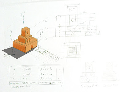
Working Drawing Starter Kit - Isometric Drawing and Exploded View

Isometric Drawing

To be used for Part Labeling


Exploded View

To illustrate how parts come together. Also known as assembly drawing for use as a guide during assembly.

Material Surface Illustration Starter Kit


Drawing your product used in context is not just about drawing proportionately, to scale and rendering.

The ability to Illustrate the correct material representing surfaces of wood or acrylic is equally important. Within this example, there is also some tips on how to illustrate a 3D organic surface using isolines (or contour lines).

Working Drawing Starter Kit

Sample (Draft) Working Drawing Layout.

Plan before hand where you want to place your information on your A2 Presentation Board. You may use an A4 or A3 paper to draft out where you want the necessary drawings to be. Use that draft to create your actual Working Drawing.

Sample - Orthographic Projection and dimensioning

An orthographic projection is drawn to scale. Remember to adhere to standard rules for type of line works, placement of arrows, leader lines, dimensioning circles and radius and inputting numbers, etc.