Below are samples of my students works at the development stage. 'Beefing' up is done on my iPad Pro after a photo is taken off the relevant pages. Some 'beefing' up is prepared before the lesson, some done live in class. Student's original A3 works on paper are untouched.
Student's work (1)
Summary of examples:
Student's work (1):
Lots of a variety of sketches but not catogorised with suitable sub-titles. Making understanding difficult. Beefing up on development sketches focusing on selected features from a solution.
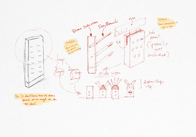
Student's work (2):
Student sketched parts with changes from one to the other without referencing to the solution. Making page look like a catalogue of parts. Beefing up includes sketching in pens/pencils on the improved features.
Student's work (3):
Student had difficulty sketching in pens/pencils inclined at an angle on an isometric block. Beefing up includes suggestions to overcome (temporarily) lacking in skills to sketch using a 2-dimesional approach.
Student's work (4):
Student sketched in 2D and thinks the process of development is complete. However sketches in 2D fail to show how a product/object is like in real world 3D form. Beefing up includes two ways to represent a 2D shape three dimensions - a flat organic shape or a spherical organic shape. (using contour lines to represent surface curvature).
Student's work (5):
Student's work shows a variety of modifications to the size of a part of the solution. However all of the sketches did not show what it is suppose to hold. Beefing up includes showing items that is being held and what other additional supplementary sketches can pop up after including items.
Student's work (6):
This example is one of the most common mistake students make. Almost every student make the mistake of drawing the items to be held / stored on the holder too tiny. It can be very comical when the product is drawn in real size while keeping the proportions of the size of the pen/pencils held in there. Beefing up includes sketches of pens/pencils appropriately sized for the proposed holder.
Student's work (1)
Student submitted this page of development (on shapes).
At a glance one could not quickly tell the differences for each of the variations made in the page.
A suggestion to categorise specific focus for modifications.
Tips: Highlight intent with quick notes to inform reader (marker) what is being done.
I extracted a section of the student's work for a live demonstration on how presentation of sketches could be made more obvious. Focusing on variations for the 'legs' of the product I exaggerating the sizes to show 'changes' and how those changes affects the looks of the original solution.
Important: At the end of the exercise a decision must be made to select the best combination.
Another demonstration showing various options for the body.
And how changes can affect the other parts of the solution.
Student's work (2)
When I saw this I thought I saw a catalogue of hardware parts.
Picking parts of a product and drawing variations out of them in silo does not help in design development. There is not way to visually assess how the overall product will look like when fitted with each of those variations.
Suggestion to draw parts with the body remaining constant. i.e. no change in shape or size. Only varying size of 'wing' and how it can subsequently affect the way it hold pens/pencils.
Student's work (3)
Student came to me with difficulty sketching in pens/pencils at an angle on a 3D block.
My suggestions: Student can sketch them in later (or after teacher's intervention). However at that 'stuck' moment, one way to get out is to draw the same solution on its 'Side View'. It is clear that once it is sketched on its side view, drawing pens / pencils at an angle becomes more manageable. With some help and more demonstration the student should be able to draw pens/pencils into the 3D block.
Student's work (4)
This example shows how a sketch can be taken further. Many students end up with a 2D sketch and expect that it is sufficient for development. The problem with a 2D sketch is that it does not show if this solution is a flat (block) or a spherical organic form.
A solution must eventually be presented with its third dimension be it using the isometric, perspective, or oblique method or in orthographic forms. Unless product is a printed image on paper.
Here I demonstrated very quickly how this 2D whale shape can either be a flat Isometric or a spherical organic form.
Tips: Drawing contour lines on a spherical organic form is critical in showing curvature.
Student's work (5)
This student followed the instruction to draw variations of the parts (in this example the wings). However he has forgotten to include what the wings are for? That is to hold pens/pencils. But they are no where to be found. Therefore making proposed sketches meaningless.
Bottom right shows teacher's intervention to show how pens/pencils could be added and how the shapes and sizes of the wings may affect the total number of pens/pencils and/or the way they are being slotted in.
Student's work (6)
Every time when I see students draw like this, I like to show them how HUGE their proposed design is relative to the objects they are holding. Usually my students will go 'WOW! I didn't know I drew them so BIG?"
On the right of the page is how BIG the product will be like. At the bottom right is an example how big the pens/pencils' should be drawn instead. You must have a good sense of proportion between the holder and what will be held/stored in it.
-----------------------------------------------------------------------------------------
If my posts helped you in one way or another, I would like to hear from you.
If you have feedbacks or suggestions or differing in views I would like to hear from you too.


No comments:
Post a Comment